
The Challenge: Solving "Financial Fragmentation"
Busha began as a trusted gateway for crypto in Nigeria. However, as the ecosystem matured, our users needed more than just a trading platform—they needed a single place to manage their entire financial life. We redesigned Busha 3.0, evolving it from a "Crypto Exchange" into a unified "Money App." The new design contributed to $1.5 Billion in transaction volume and a 34% increase in user retention.
Phase 1: The Audit & Discovery
"Before we could build the future, we had to map the present."
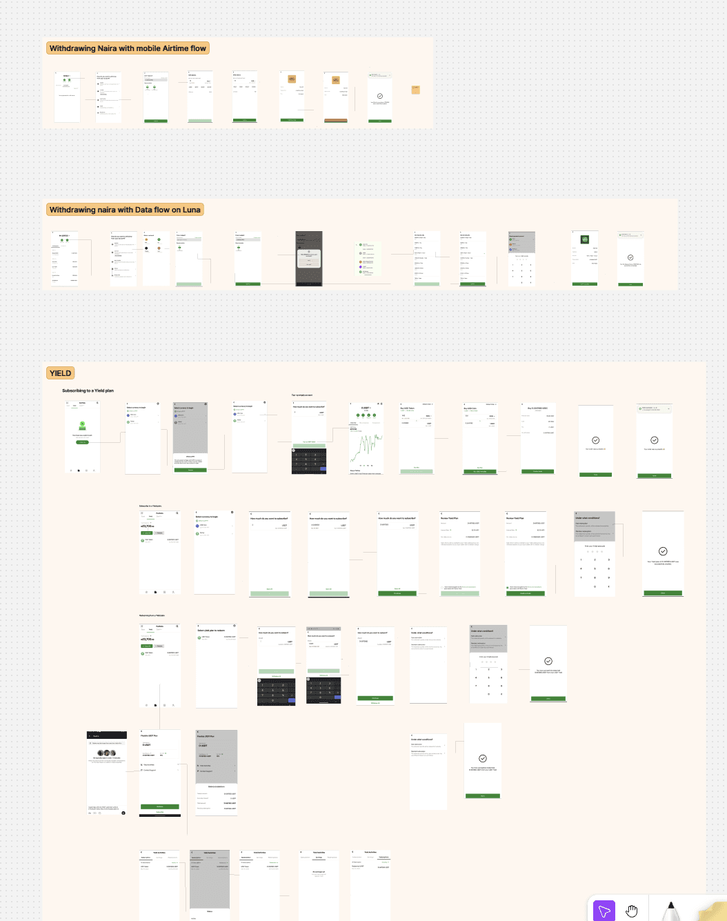
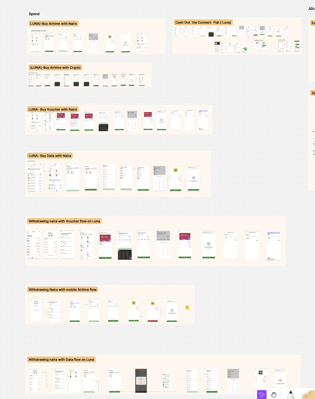
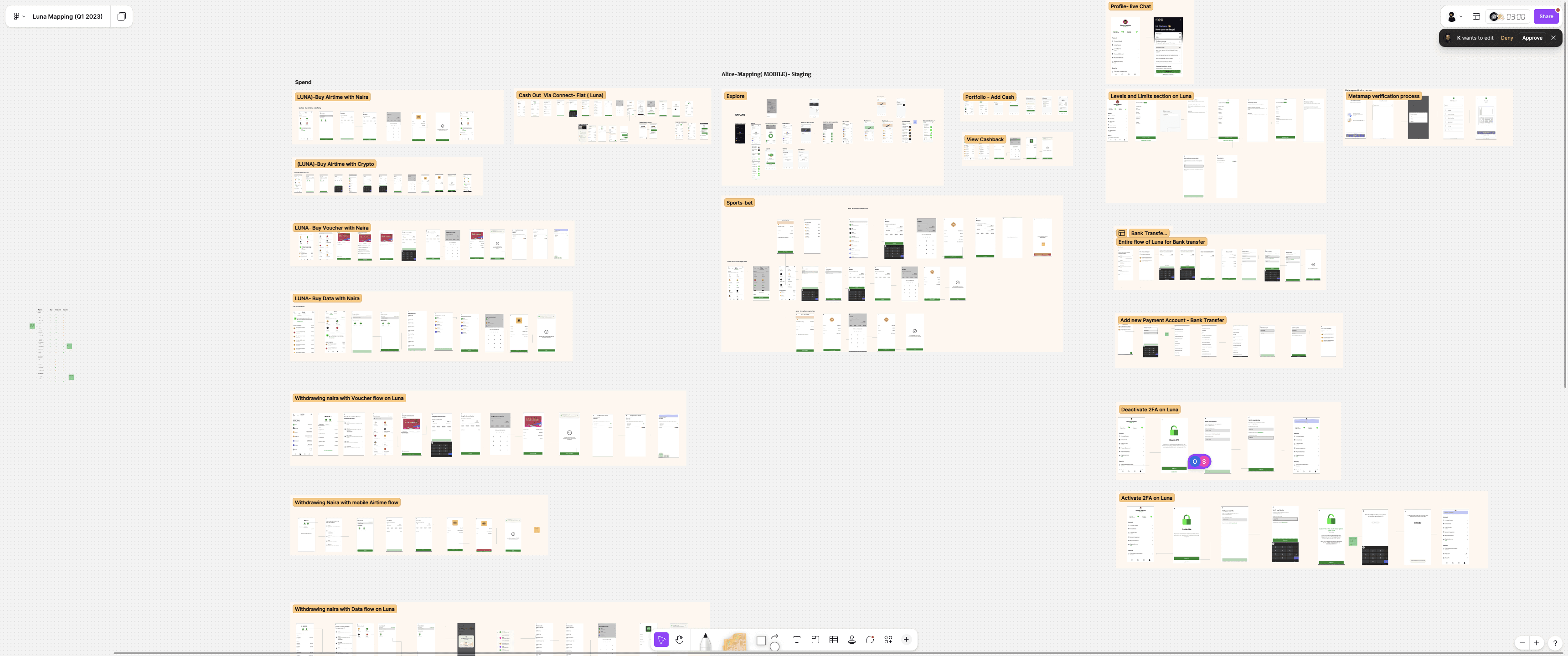
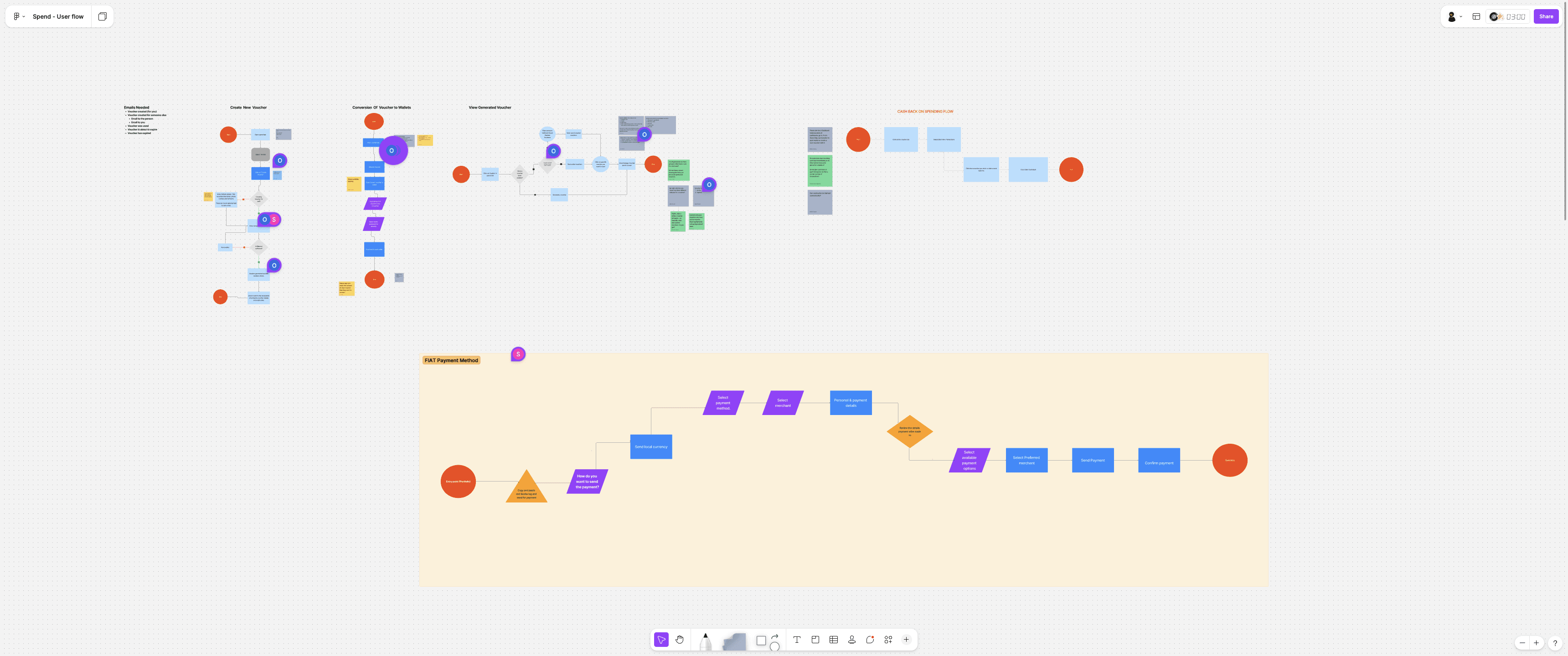
1. Mapping the Ecosystem
Our first step was a comprehensive audit of the existing application. The platform had grown organically, resulting in a sprawl of disconnected features—from buying airtime and data to yield farming and sports betting.
I created a high-level user flow map (shown above) to visualize every possible path a user could take. This bird's-eye view revealed several critical issues:
Feature Bloat: Essential financial tools were buried under lifestyle features like betting and vouchers.
Inconsistent Patterns: The "Cash Out" flows differed significantly depending on whether the user was withdrawing via Airtime, Data, or Fiat, increasing cognitive load.
Fragmented Yield Flows: The subscription process for "Yield" plans was multi-stepped and disconnected from the main wallet, making it harder for users to discover and commit to saving.
2. User Interviews & Pain Point Validation
Armed with these maps, we conducted in-depth interviews with current users to validate our hypotheses. We walked them through the "Happy Paths" and "Edge Cases" mapped above.
Key Findings:
Confusion on "Spend" vs. "Withdraw": Users struggled to differentiate between spending crypto (e.g., buying airtime) and withdrawing fiat. The mental models were conflicting.
Yield Hesitancy: Users were interested in earning interest (Yield), but the multi-screen subscription flow (seen in the 'YIELD' map) was too intimidating and lacked clear "what if" scenarios.
Information Overload: Users felt the app was trying to do "too much" at once, and they often left the app just to check market prices or news.
3. The Pivot
This mapping exercise was the turning point. We realized we didn't just need a UI refresh; we needed an Information Architecture (IA) overhaul.
Our Goal: Simplify the complex legacy map into four distinct, intuitive pillars:
Trade: Buying, selling, and swapping assets.
Spend: utilizing crypto for real-world utility (bills, airtime).
Grow: Passive income and yield generation.
Explore: Market intelligence and discovery (news, trends).
The Challenge: Solving "Financial Fragmentation"
User research revealed that our users were living fragmented financial lives. To manage their wealth, a typical user was juggling 4-6 different apps:
Local Banking: For daily fiat transactions (e.g., GTBank, Kuda).
Crypto Exchange: For trading digital assets (Busha).
Wealth Management: Using niche apps like Piggyvest or Cowrywise for automated savings.
Utilities: Separate platforms for airtime, data, and bills.
The Friction: Users were forced to move money out of Busha to save it on Piggyvest or spend it on bills. Every exit was a potential churn point.
The Goal: We set out to consolidate these fragmented needs into a single ecosystem governed by one philosophy: One App, One Balance Sheet.
2. The Strategy: A Four-Pillar Architecture
A. The Unified Home (One Balance)
The Problem: How do we show Kenyan Shillings (KES), Nigerian Naira (NGN), and Bitcoin (BTC) without overwhelming the user? The Solution: We designed a "Total Balance" header that aggregates everything into the user's preferred currency.
Visual Hierarchy: Directly below the total, we split assets into "Cash" and "Crypto" cards. This allows users to see their liquidity at a glance without tab-switching.
Result: This subtle change shifted user perception from "Busha is for trading" to "Busha is for holding wealth."

B. The "Spend" Tab (Closing the Loop)
We built a dedicated "Spend" hub directly into the navigation to replace the need for utility apps.
The Feature: Users can now pay for Airtime, Data, and Betting services directly from their Busha balance.
The UX Hook: We added a "Cashback" incentive (up to 5%) clearly visible on network selection screens (MTN, Airtel). This turned a boring utility task into a retention loop.

C. The "Grow" Hub (Competing with Niche Savers)
To bring savings volume on-chain, we had to compete with the simplicity of competitors like Cowrywise while leveraging our crypto advantage.
The "Yield" Strategy: We introduced Flexible (withdraw anytime) and Fixed (locked) savings plans across multiple currencies (NGN, USD, USDT).
The Design: We stripped away complex trading charts. The "Create Plan" flow is linear and transparent, explicitly highlighting the APY (up to 15% for NGN) and the lock-in period (e.g., 12 months) before the user commits.
Clarity: The empty state explicitly guides users: "Click New to create a new one," demystifying the investment lifecycle for non-traders.


D. Contextual "Explore" & Smart Actions
The Insight: Meeting Users at the Point of Intent We identified that when users view the asset details of stablecoins (like USDT or USDC), they are primarily assessing their liquidity and spending power. This creates a high-intent moment where the user is mentally bridging the gap between "holding assets" and "needing cash."
The Solution: Dynamic Smart Upsells Instead of relegating loan products to a separate "Loans" tab, we integrated a Smart Upsell Banner directly within the asset screen.
Contextual Relevance: The feature targets users holding stable coins with sufficient depth, offering immediate liquidity without requiring them to sell their position.
Dynamic Calculation: rather than displaying a generic marketing message, the banner is personalized. It calculates and displays a specific figure (e.g., "Borrow up to ₦1.7M") based on a 60% Loan-to-Value (LTV) ratio of their current holdings.
The Impact By positioning the loan offer exactly where the user is evaluating their wealth, we reduced the cognitive load required to find liquidity options. This turns a passive "viewing" session into an actionable opportunity, creating a seamless user journey from asset management to borrowing.

The Impact
By restructuring the application into four clear pillars—Trade, Spend, Grow, and Explore—we successfully transformed Busha from a complex utility tool into a cohesive financial ecosystem.
Increased Feature Discovery: The simplified navigation helped users find previously buried features. We observed a significant uptick in engagement with the Yield (Grow) and Spend products, as they were no longer hidden behind complex menus.
Enhanced User Trust: The transparency of the new Crypto-Backed Loan flow—specifically the "Health Meter" and clear liquidation terms—reduced user anxiety. Early feedback suggests users feel more confident taking leverage when the risks are visualized clearly.
Retention through "Explore": By bringing market news and "Top Movers" directly into the app, we successfully reduced the frequency of users leaving the app to check external sources like Twitter or CoinGecko.
[Optional Metric Placeholder]: e.g., "We saw a 15% reduction in support tickets related to 'how to withdraw' due to the clearer separation of Spend vs. Withdraw flows."
What I Learned
Redesigning a financial product of this scale taught me that clarity is the ultimate luxury.
1. Trust is Designed, Not Given Designing the Loan flow taught me that in fintech, transparency isn't just a legal requirement; it's a UX feature. Users are willing to engage with complex financial products (like collateralized loans) only if the interface communicates risk in plain, human language rather than banking jargon.
2. Don't Just Decorate—Architect The audit phase was the most crucial part of this project. Realizing that the "Spend" and "Withdraw" flows were conflicting wasn't a visual problem; it was an Information Architecture problem. This project reinforced that a Product Designer must first be a System Architect before they can be a UI Artist.
3. The Power of "Contextual" Design With the Explore tab, I learned that data is most useful when it leads to action. Showing a news article about Bitcoin is good; showing it right next to a "Buy Bitcoin" button is better. Connecting discovery (news) to utility (trading) creates a seamless loop that benefits both the user and the business.

